Health Insurance Funnel Optimization
Reducing Drop-offs in the buying journey by 35%
CONTEXT
80% of high intent users dropped off before payment step
Users who had already entered details, selected and compared quotes were leaving the flow without reaching the transaction screen.
TEAM
1 Design Manager
1 Product Manager
3 Engineers
DURATION
3 Weeks
MY ROLE
Ideation
Conceptualisation
Product Architecture
Design and UAT
TOOLS
Figma
Cursor
Claude
Notebook LM
IMPACT
I focused on diagnosing the biggest conversion bottleneck in the entire funnel.
35%
Increase in health declaration completion
18%
Increase in purchase
conversion
25%
faster completion
of the flow
40%
reduction in support
queries
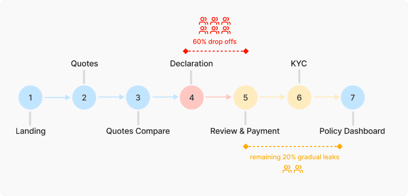
THE PROBELM
What was happening?
60% of users dropped off during health declaration. These users had already selected plans and add-ons which showed their intent to purchase was strong. Something in this and subsequent steps was blocking them.
PRIMARY ISSUE
High abandonment at health declaration
SECONDARY ISSUE
Further leakage in next steps
UNDERSTANDING THE DROP
Why were users dropping off after completing 4 steps already?
We looked across mutiple sources to identify the reason of struggle.
Funnel Analytics
Customer Support Queries
Internal Team Discussion
INSIGHTS FROM THE RESEARCH
Most of the users felt uncertain while filling out medical information.
Scroll to see insights

How might we help users complete health declaration and subsequent next steps
with clarity and confidence?
The experience needed to feel manageable and trustworthy.
DEFINING THE FRAMEWORK FOR IDEATION
Based on the insights, I set 4 principles to guide the re-architecture of the user flow
Making it manageable
Break large forms into smaller decisions
Simpler terms
Replacing technical terms for easy understanding
Reducing uncertainity
making users confident while
answering
Showing progress
making their effort
visible
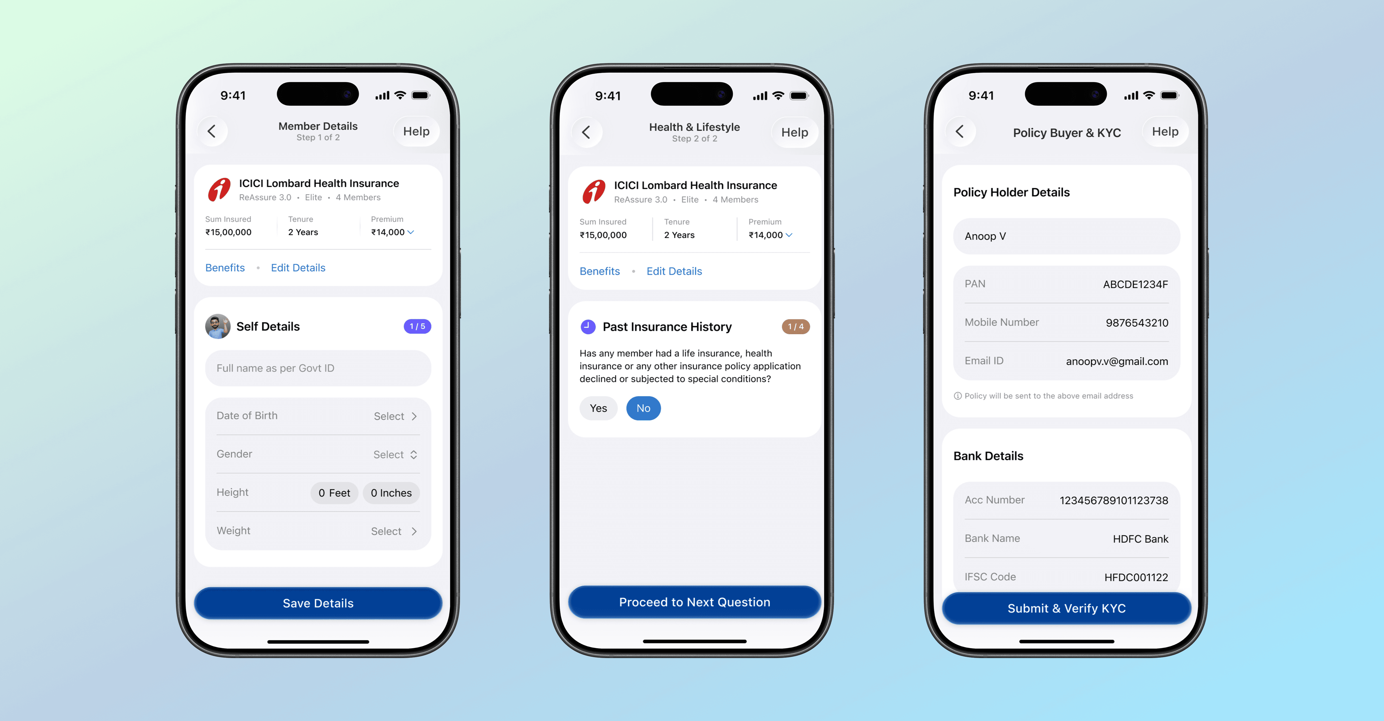
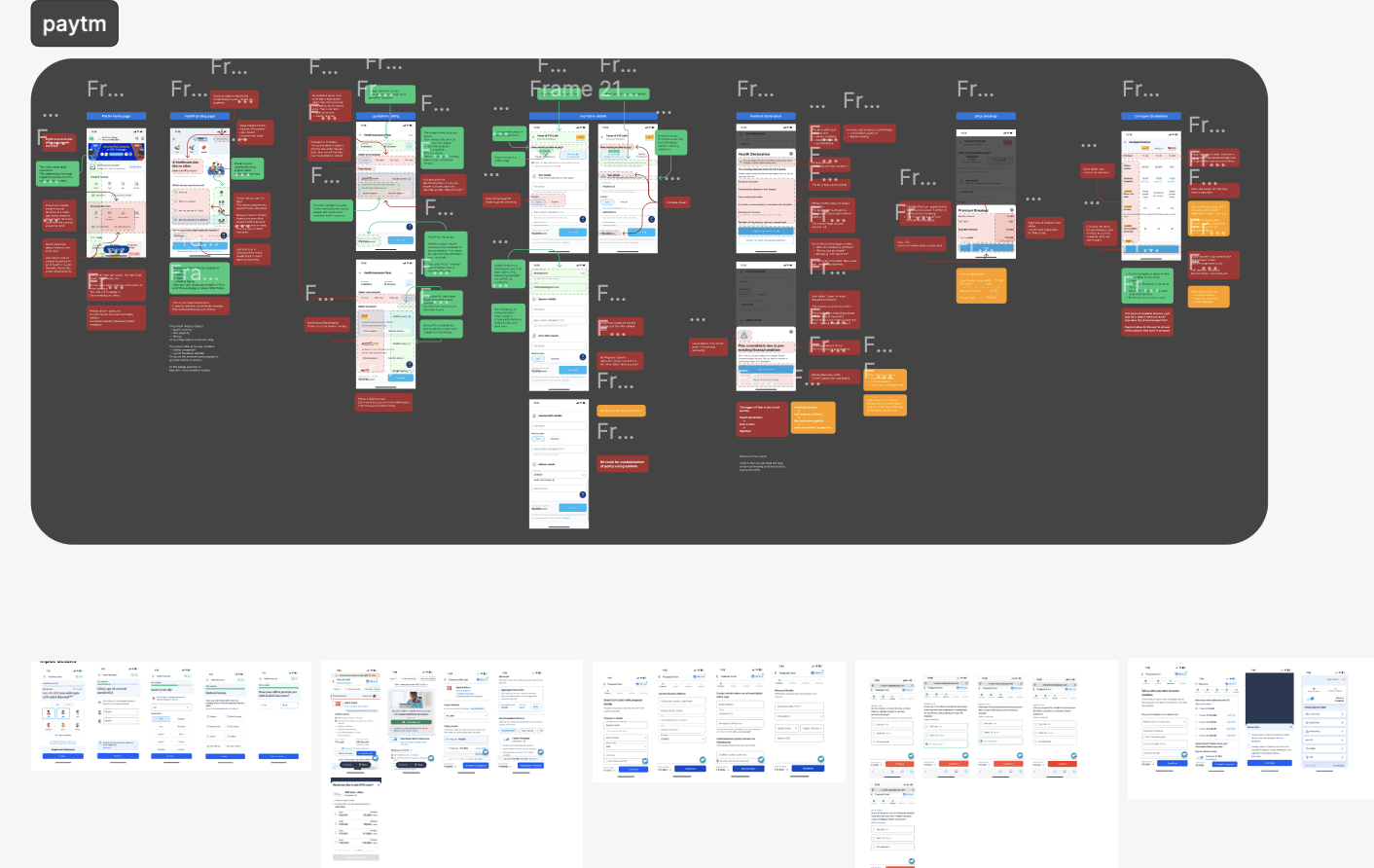
TARGETING 4TH STEP OF THE JOURNEY - MEMBER DETAILS
This section needed to make the process of inputting member details smooth and less like filling a form
IDEATION 1
What worked 👍
Segration of information in different sections
What worked 👍
Context driven structure & CTA
What Didn't 👎
Increase in clicks and 1 more scroll
IDEATION 2
What worked 👍
visuals associated with each member was more contextual
What Didn't 👎
Increase in clicks and 1 more scroll
What Didn't 👎
Universal CTA performed secondary action within screen which could confuse some users
IDEATION 3
What worked 👍
Giving context about user's selected policy
What worked 👍
Showing the number of members in the flow
What worked 👍
Using parent CTA wrt context of the info on the screen
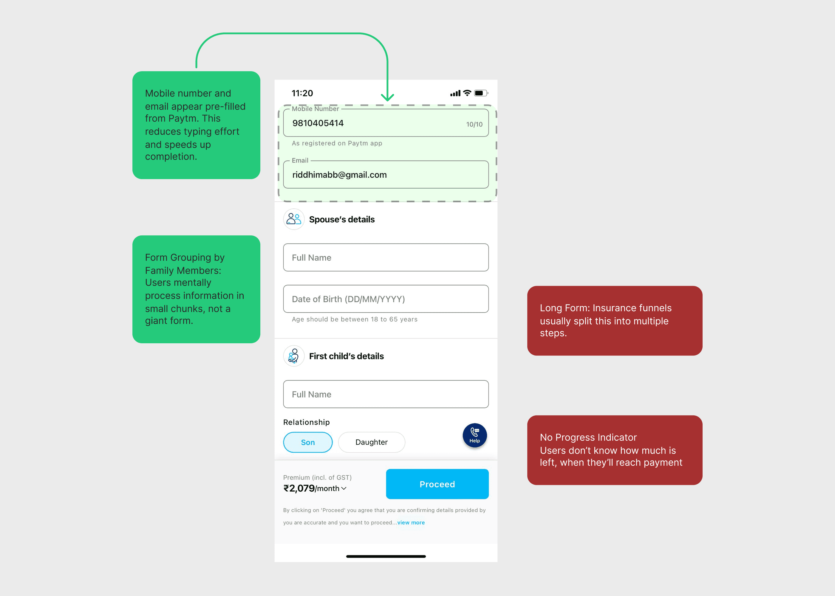
TARGETING 4TH STEP OF THE JOURNEY - HEALTH DECLARATION
The main objective was to simplify the structure of the questionaire screens
IDEATION 1
What Didn't 👎
This interaction made the form quite long. This consisted of 3-4 scroll views since some questions even had subsections
What Didn't 👎
The chips style interaction was not scalable for more than 2 members.
IDEATION 2
What worked 👍
Segregation of multiple questions in one category reduced cognitive load for the user
What worked 👍
Reduction in 2-3 scrolls of the page to just 1 scroll.
FOCUSING ON 5TH STEP - POLICY REVIEW PAGE
The main agenda was to provide easy to digest information without overwhelming the user.
IDEATION 1
What worked 👍
Action oriented CTA
What Didn't 👎
Stepper progress is inconsistent to previous progress steps
What Didn't 👎
Volume of information > mental processing
IDEATION 2
What worked 👍
Prompting the user to engage with complete the transaction
What worked 👍
Giving context to the user about next steps without causing fear
What worked 👍
Presently all Important information in a clean and concise manner
FOCUSING ON 6TH STEP - KYC FLOW
The aim for this was to inform the user to complete
KYC for issuance of policy
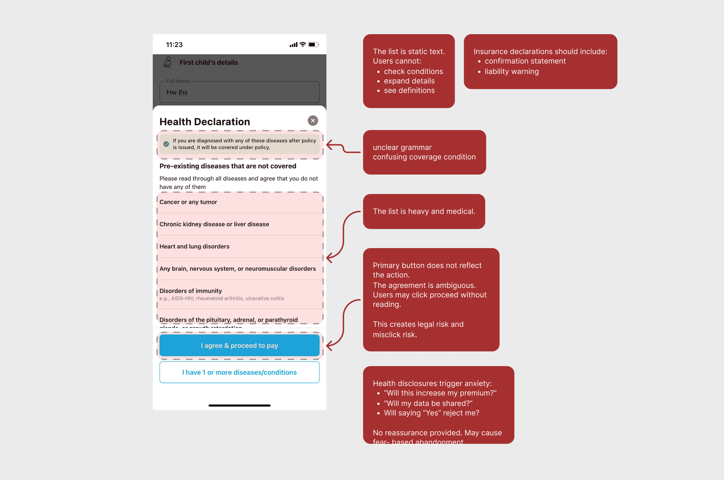
Second bottleneck for that most users closed the app after doing their payment assuming policy has been issued. They didn't realise that KYC was a mandatory step required for it to happen.
IDEATION 1
What worked 👍
Action oriented CTA
What worked 👍
Giving context to the user about next steps without causing fear
What worked 👍
Presently all Important information in a clean and concise manner
OUTCOMES
Simplifying disclosure helped users move forward with confidence.
35%
Increase in health declaration completion
18%
Increase in purchase
conversion
25%
faster completion
of the flow
40%
reduction in support
queries
REFLECTION
Designing insurance is basically
designing for trust
When questions feel confusing or high stakes, users tend to stop. Not because they don't want to buy insurance but because the entire experience makes them doubt themselves.
This project has made me realise that designing in complex, sensitive contexts is not just to simplify the information, but also to simplify the feelings of the user.
